Publicis Sapient - [ Fintech ]
Digital transformation - Nationwide Building society
Senior Visual designer / UI
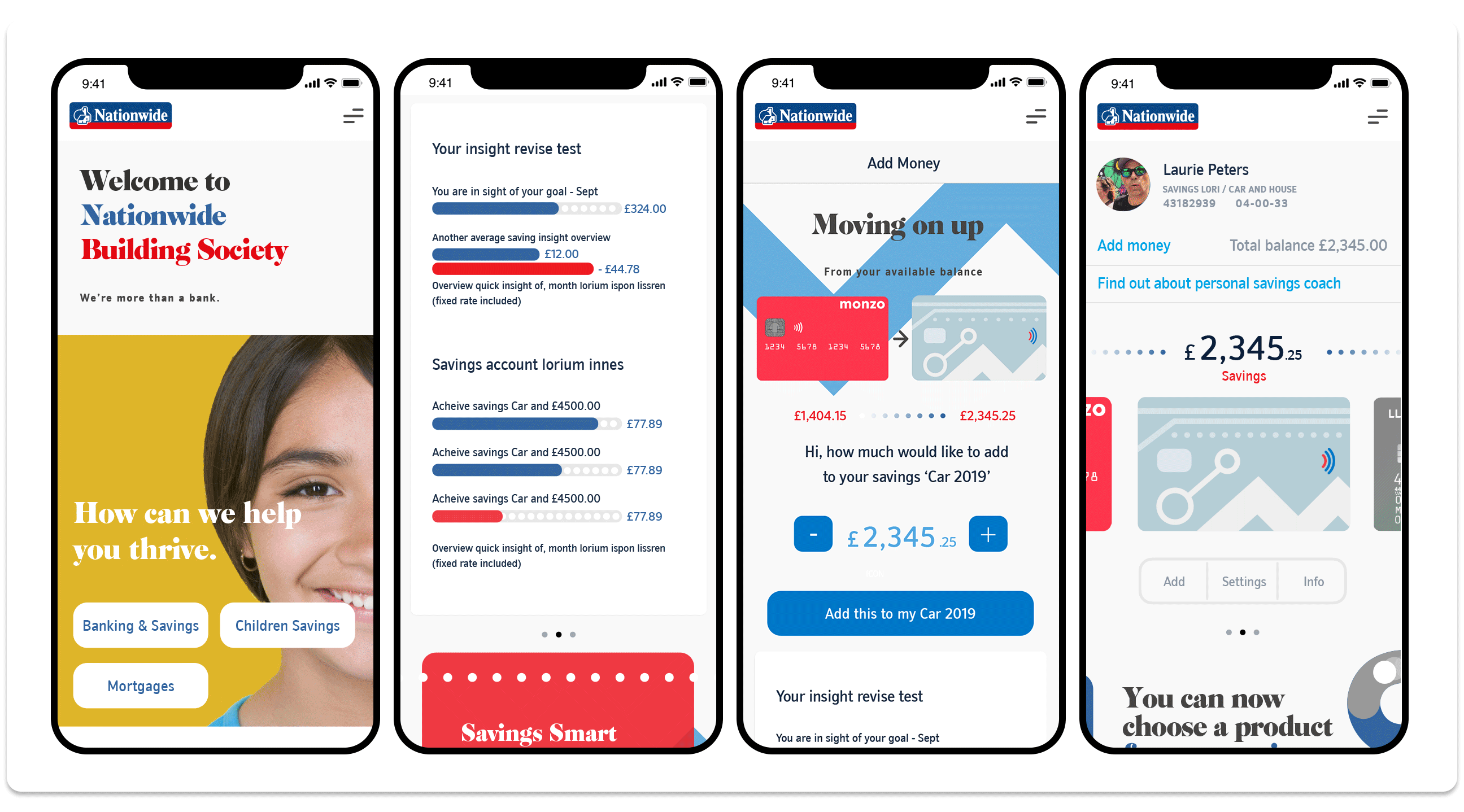
Publicis Sapient are currently in the process of digitally transforming new customer journeys across
Nationwide's various banking products.
My role as senior visual designer/UI is in creating new concept designs and in delivering design changes to the current journey state. I work as part of the design hub where I collaborate with service designers, product owners, business analysts, content/UX and experience designers. In supporting the digital team I also work closely with content designers, front-end and back-end React dev teams. I attend and add to all design ideations, team planning sessions and agile retrospectives.
As part of Sapient's digital transformation team we have creatively explored the idea of 'assisted intelligence' to coach and mentor customers that want to set goals to save money. We have also explored how we can use the Open Banking Service, mainly in shortening the application process and in cross selling products to assist these goals. We have looked at how we adapt tone of voice into something more conversational and human to improve the entire customer experience. These Sapient projects are still developing and will be delivered across the next couple of years.
Currently Sapient - [ Feb till the end of Aug 2019 ]
![]()
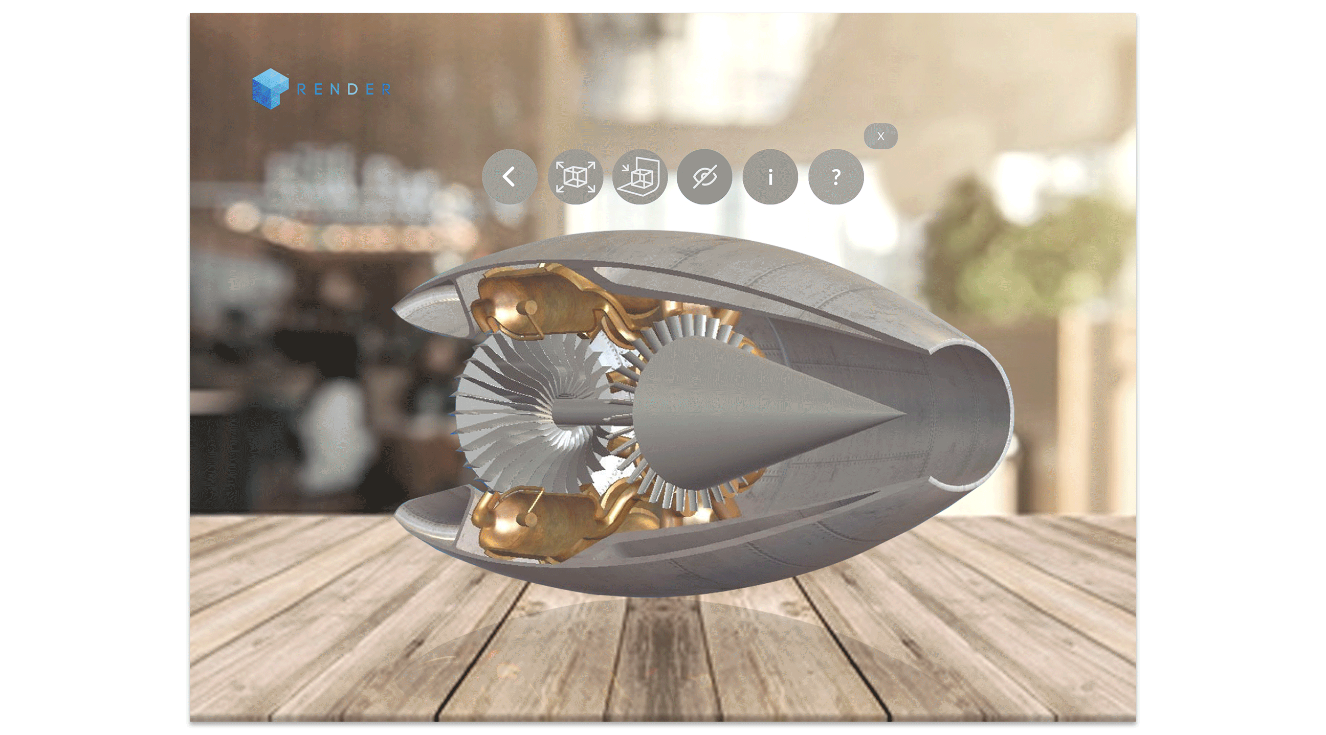
Render VR | AR
Various AR / VR UI projects
Senior visual designer - UI
Render is all about delivering creative solutions to complex problems.
I worked remotely with Render in producing scamps, moodboards, low/high fidelity UI designs for their various clients.
![]()
MSA augmented reality app that Augments MSA products into a real environment over mobile. This product helps MSA's sales team to visualise their product solutions on site (to actual scale) with the benefit of showing their clients potential solutions in realtime.
CLICK HERE - MSA UI VISUALS
![]()
Engine combustion experience allows users to explore the functional and chemical aspects of a combustion engine through augmented reality on ipad devices.
CLICK HERE - COMBUSTION SCAMP VISUALS
Various dates across 2017/18/19
![]()
Airbus VR menu system that allows VR Experience presenters to navigate and select VR content to play prior to the experience going live.
CLICK HERE -AIRBUS UI VISUALS
Think Heavy [collab]
Arena app
Senior Visual designer / UI / UX
I use and like Spotify...but, did you know the artists on their platform are only paid a tiny fraction of a penny for every time a user streams one of their tracks. Generally, music subscription platforms don't pay artists enough when fans stream their music.
Arena (a music streaming platform) on the other hand, is different.
Music on Arena is free to stream for the fan without annoying commercials or in-app interruptions. Incredibly, even though Arena don't charge a monthly subscription fee, Arena pays artists the highest rates in the world whenever their music is streamed or downloaded. Good news for the artist.Arena Music pays artists a full penny per stream and the highest rates in the world for music and merchandise sales.
— Bigup ^ 😉
— Mark Pritchard, Warp Records

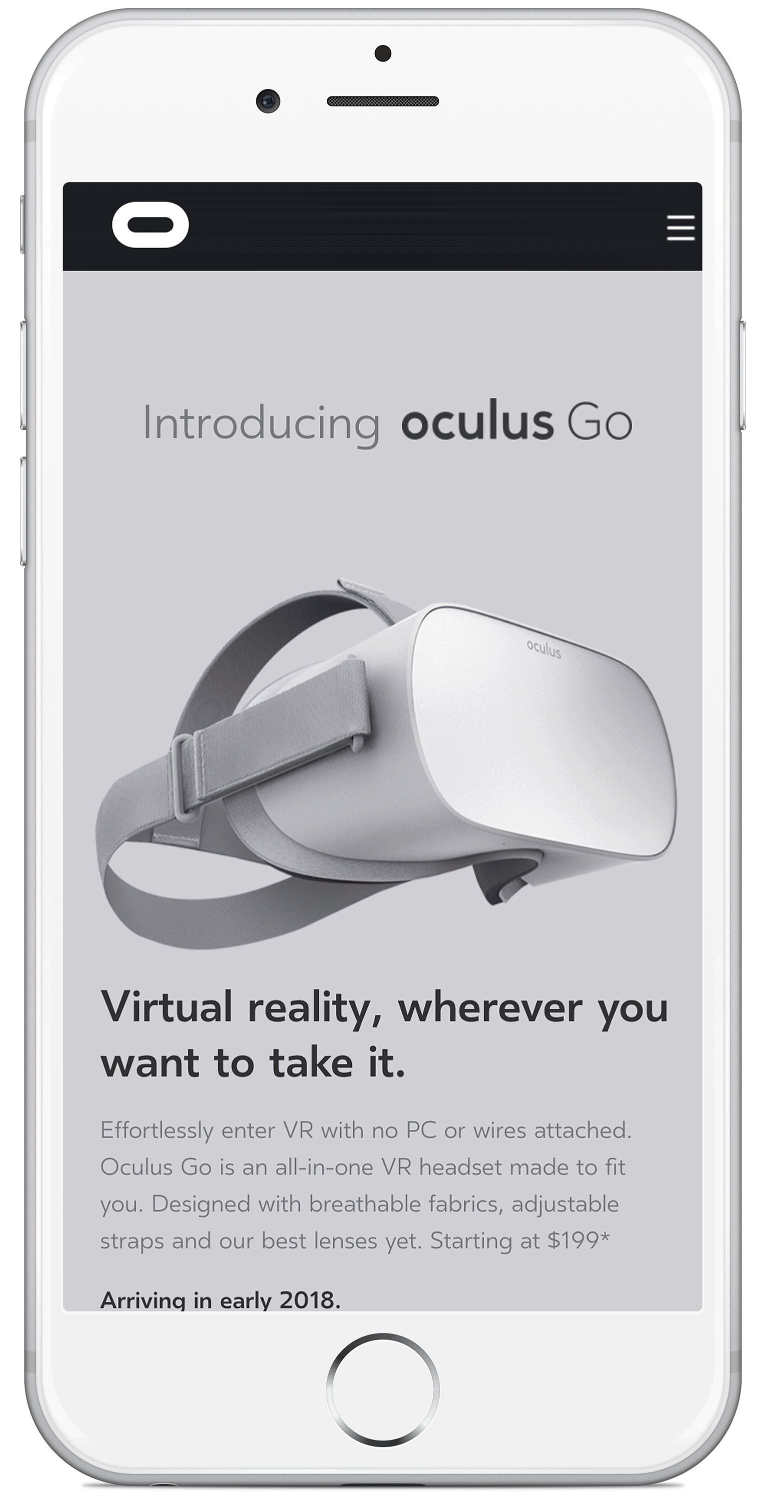
I have personally been a registered games designer for Oculus and their competitors Vive, since 2016.
Since producing a launch title for Oculus back in 2016/17 I have kept an eye on developments with the 'Oculus GO'. However, aside from this, Oculus London HQ asked if I would help design screens for the new landing page which would co-inside with the launch.
The final page design is a simple layout due to CMS limitations. However, the page drivers and animations help to lift the overall design in giving the page content a dynamic look and feel.
Due to be released sometime early 2018.
— Bigup ^ 😉
— Matthew Clarke, Adobe Digital Marketing

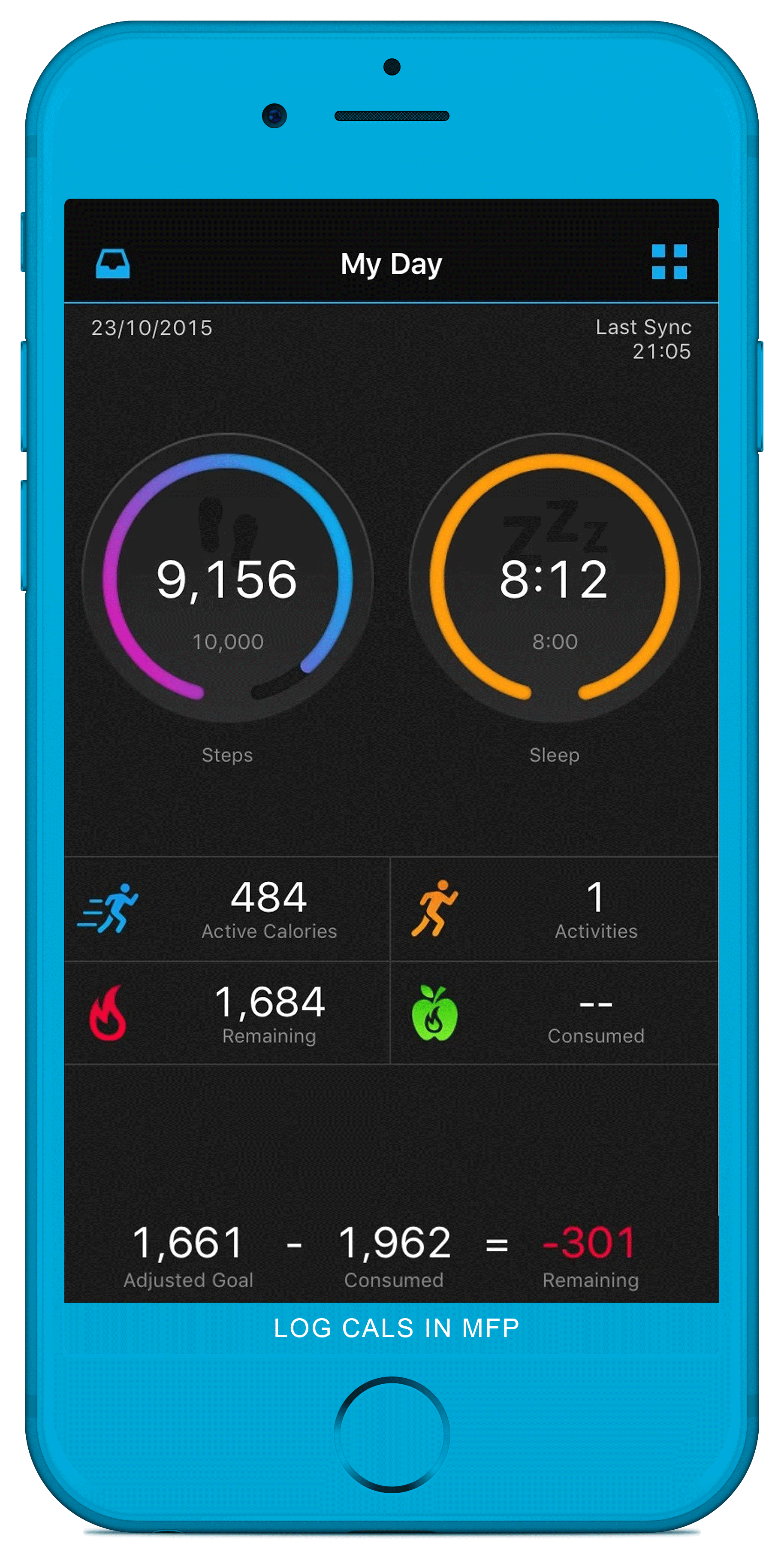
Garmin Connect is training tool to store, analyze and share all your fitness activities.
My role as a UI designer was in collaborating with UX and in creating scamps, wireframes and screens based on an established design system. More creative work would involve producing functional graphics which you can see displayed in the screen above. Garmin brand restrictions were limited in the creation of digital applications so we were able to be quite bold and experimental, allowing for bright colour pallettes and interesting ways of visualising data.
The app was launched early 2016 - I was involved in a second design iteration later in the year.
Early 2016.
I was part of a three man team developing this launch title/VR Game for Oculus. My part varied as VR games designer, concept visualiser and audio producer. I had a close working relationship with the main developer, I managed the games asset modeller and worked closesly with the writer.
The game was designed and built over a couple of years and sold in the Oculus store with the first consumer Oculus Rift headset as an official launch title game. We were the first british indie title for land a game on Oculus Rift.
The game places you virtually in the cockpit of a jet propelled craft. You manouveur the craft across the moon and mars where you deliver and collect packages as an off-world courier. The world was designed and built by myself and the developer. Game-play models and assets were conceptualised, mocked-up and skinned by me and built by a contracted 3D Unity™ modeller.
Oculus
Vive [released 5 months later]
— Big Up! 😉
— J.C.Gillilan - 1 of many gamers who reviewed the game on Steam

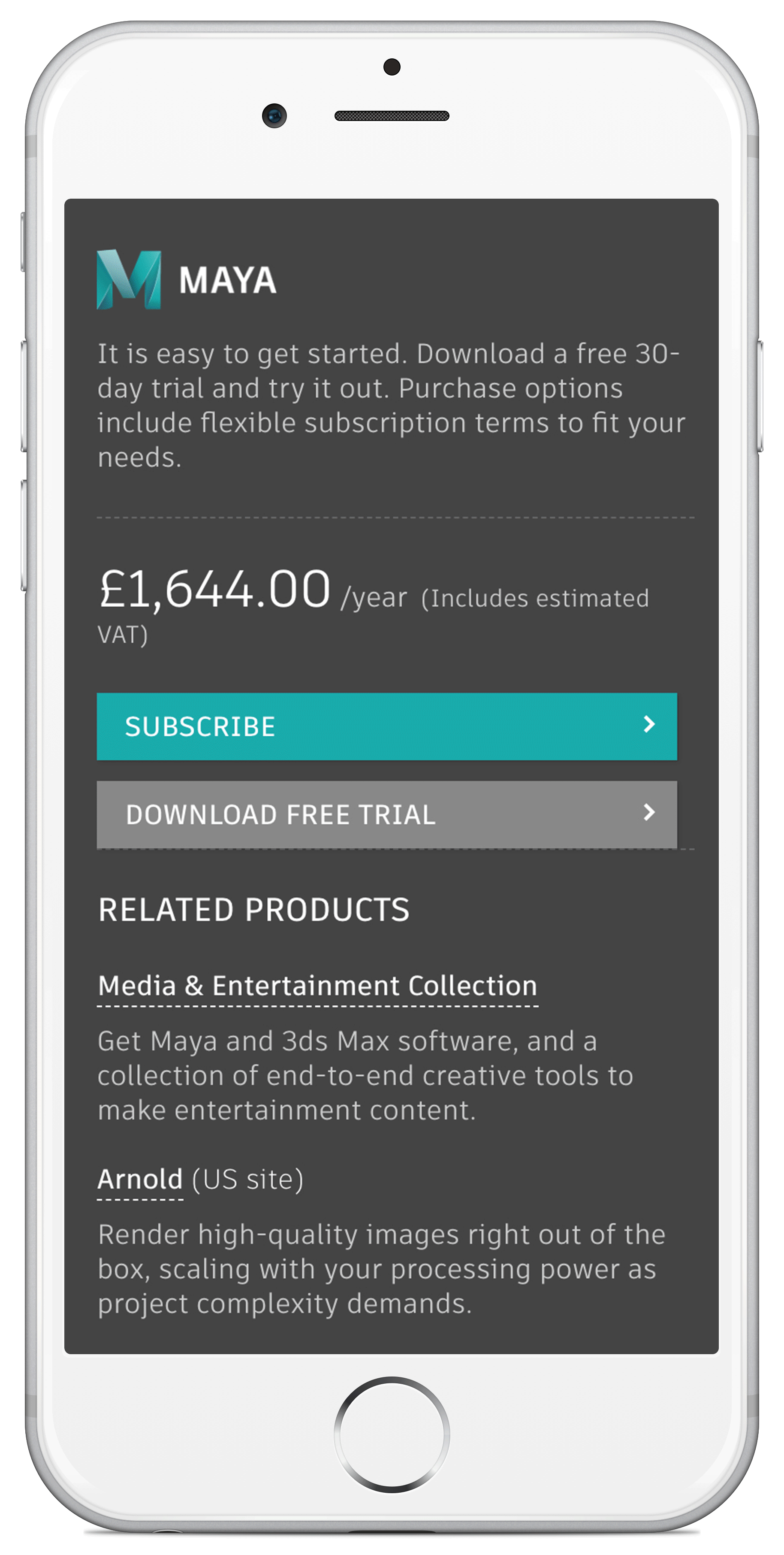
Autodesk™ makes software for people who make things. If you’ve ever driven a high-performance car, used a smartphone, or watched a great film, chances are you’ve experienced what millions of Autodesk customers are creating with their software.
The site re-skin was designed and developed to lead existing consumers directly to the three main industry categories of their software. There, new trial subscribers, IT Managers, designers could download their software.
An improved, new navigation was created to collapse across the website although design in general was relatively restricted due to CMS layout restrictions.
At the forefront, the site was restructured/designed to lower the amount of user steps leading to resubscription and trialling software. Apparently, there has been a refreshing increase in resubscribers and new customers trialling software since the site was re-skinned.

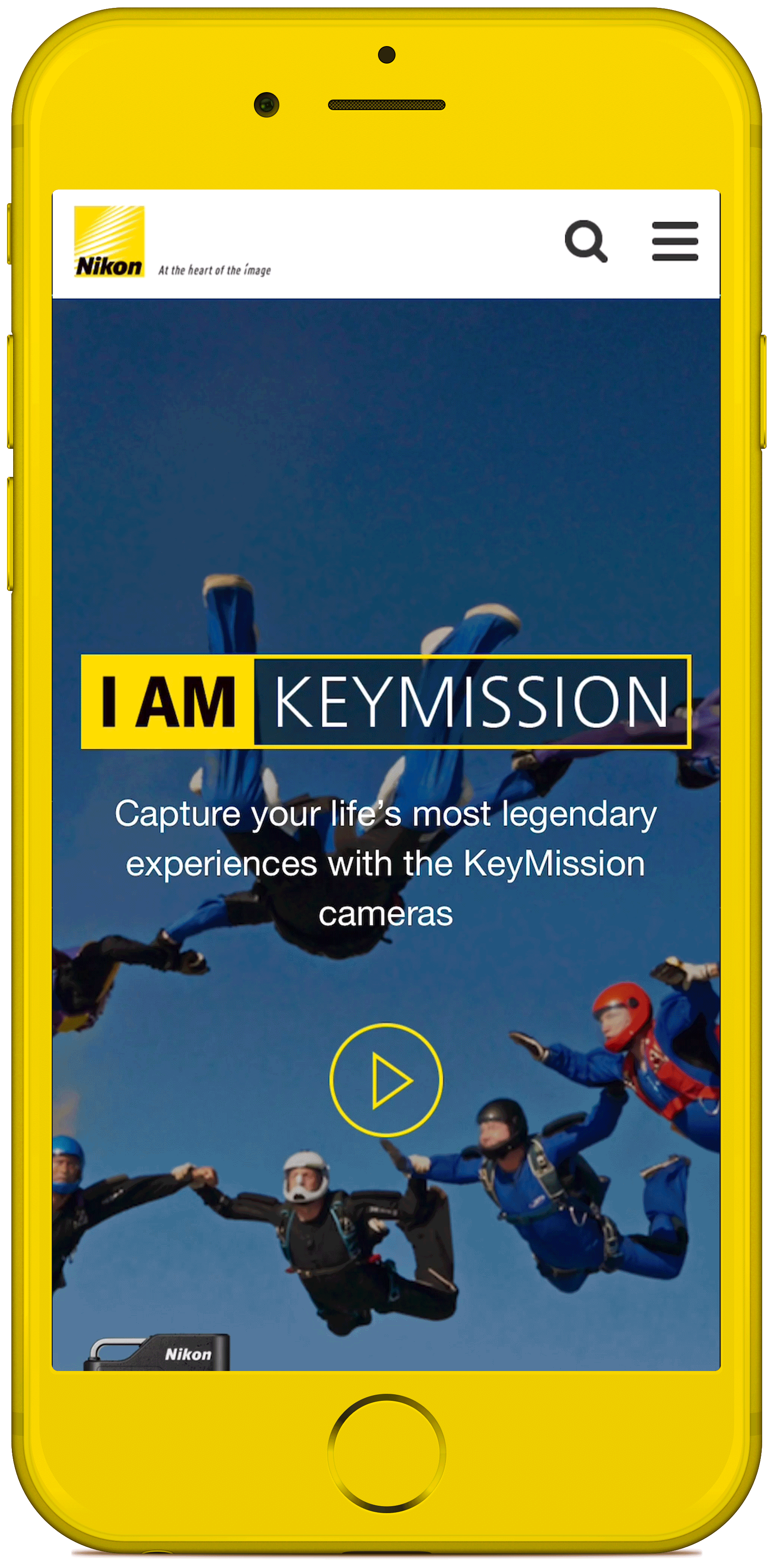
It’s not what you do, it’s why you do it. This Nikon site was designed to promote the new 360 camera range whilst also inviting customers to capture their missions and share their story with Nikon, and the world.
The 'I am Keymission' Nikon site is a dedicated product site in the Nikon camera range. All products connect and pair to the SnapBridge 360/170 APP.
The site had to feel more like a microsite and different to other section pages in the Nikon main site CMS. Design freedom was partly limited due to CMS layout restrictions. This didnt hinder the overall look and feel of the final design.
The design was originally for the uk/European audience and was slowly published across sites globally.
Available since Nov 2019
My name is Laurie. I'm a senior designer from the UK. Im passionate about design, UI and things working and looking good. I base myself in the southwest of England although i've worked with companies and people all around the world.
I graduated in Design at The University of The West of England in 98'. After graduating I interned at the BBC's design department in Bristol before begining a career as a digital designer.
I've worked agency and client side across a wide range of digital channels throughout my career, Video and brand photography, animation and television, Illustration and storyboaring, UI design for web, app design, augmented reality and virtual reality.
I am currently working for Peters-Fox as creative director.